
Web Design Trends in 2016 – Pros and Cons
Web design trends like many other trends come and go. Sometimes they are dictated by necessity (like adaptive design). Other time they simply come with the changes in an industry and the tools it uses (e.g. Flash is outdated). Your decision to follow a particular trend should depend on the needs of your customers and your business. Implementing a new trend should never be just about “I like it and big brands are using it so it’s the best thing for me”. Trends fade away. And a website built solely on a trend will have a short life. Or worse – it won’t sell!
Here are some web design trends for 2016.
I. Everything goes under one single Hamburger Menu
Since mobile devices are something normal, web designers started simplifying the navigation, thus the hamburger menu appeared. This is a trend that made its way to the desktop versions and users don’t seem to mind it. But this type of menu is not an universal cure and it can take down some of your website’s usability.
The outcome can be harmful, especially if you’re developing a news or e-commerce platform where finding particular content is vital for keeping the users on the site. A better performance can come from additional title lists (news titles) or text search placed somewhere visible.
Even if the global navigation is harder to create and support most websites are still putting the most important categories on a visible place. This is the most effective way to help customers find what they are looking for on your site.
Here are some ways to find out if “hiding” the global navigation is for you:
* High rate of users dropping out of landing pages – users won’t stick around if the global navigation is not easy to find.
* Where users click – did they really click on the hamburger menu? If implementing the new menu comes with a big drop in users then something’s wrong. You can check the clicks on your website through the Crazy Egg heat mapping tool. Don’t forget that the users’ behavior will determine if you need to use the “hidden navigation” or another form of the modern navigation designs.
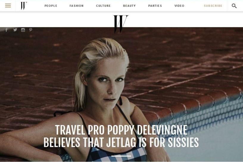
II. Carousel with images on the home page
Carousels are everywhere. They can create visual interest and reduce the mess on your home page but overusing them can lead to the banner blindness effect – then users can easily ignore your messages.
Here are a few thing to consider when it comes to carousels:
1. They are bad for SEO: the lack of content in them means that it’s hard to get meta information from your web page. Google no longer tracks meta key words on the page (unlike Bing) and if the sliders don’t contain any text the search engines cannot track them. The lack of text in the carousel can be compensated with text in the page body as well as in the sliders’ titles that have the H1 tag. This way a slider can become more readable by the search engines and you can avoid the negatives on the SEO.
2. They worsen the effectiveness of the content they include: carousels often contain high resolution images that are not optimized and therefore cause the home page to lag when loading. Have in mind – this is the most important page on your website. Sliders also use JavaScript or JQuery which can also cause problems.
3. Important content gets pushed down the page. Even though mobile devices taught users to scroll down and the chance to see content that’s further down the page is higher, Google does not recommend showing important content further down the page.
A study shows that only 1% of users click on carousels (banner blindness). Of course this should not be a deal breaker for you. Simply decide whether it’s cost worthy for you to use them and be careful when creating and optimizing them so that they don’t harm UX and accessibility.
A modification of the carousels are the sliding animations. They don’t ask users to go through several images – the content simply pops up and refreshes before their eyes.
IV. Parallax Content
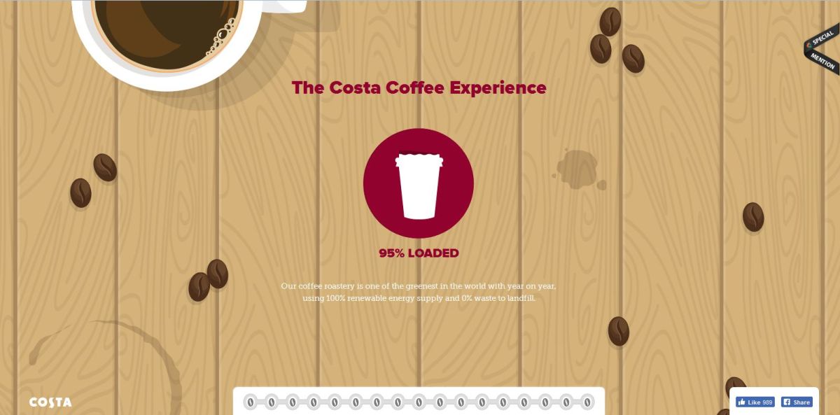
Over the last few years websites with parallax content have become very popular. The Parallax Technique allows content in the fore- and background to pass at a different speed thus creating the illusion of depth. It can work as an amazing presentation but it’s hard to say whether it’s usability friendly. The problems with parallax websites are similar to those of the carousel:
1. They are not good for SEO
2. It’s possible they drive the website’s usability down
3. It’s possible that they drive away users who find the website difficult to use. So careful think before creating a parallax website. Ask yourself if the story you want to tell is worth loosing some of your visitors. Parallax has to be done very well in order to capture the visitors’ attention.
Here’s a great article with examples of Parallax websites: www.creativebloq.com.
V. Complex cascades of images, Flash
Very often we speak about the speed at which a website loads. Avoid Flash – Google recently announced they no longer support Flash in their browser. And if your idea visually represents a cascade of overlapping images and animations, then find a way to unite them and optimize their size according to the best practices.
VI. Too much JavaScript
It seems like JavaScript is everywhere these days. Social plugins use it. So try to find a good balance between Java and WordPress plugins.
JavaScript can be extremely functional with things that other programming languages can’t achieve. But be careful not to harm the website loading speed, the mobile version, the security and the website search visibility.
VII. Typography
Even though you can use several fonts I wouldn’t recommend more than two. Too many fonts cause confusion.
Here are some tips:
1. Experiment with fonts.
2. Try to give a clean presentation that will visually show the brand’s style.
3. Use fonts that complement each other visually or are different enough to create an interesting contrast.
4. Think about what the font communicates on a psychological level. People have the same reactions to some fonts and colors. Believe it or not emotions are closely connected with typography. Serif for example creates an atmosphere of formality, Sans-serif – of security and handwriting can be perceived as supercilious. If you want your business to be seen as traditional, use Serif. If you want it to be seen as stable, a none-serif font is the best choice.
4. And please don’t write jokes in Comic Sans!
At the end of this article I need to mention minimalism! It inspired a large number of websites that are simple, clean and easy to use. Meanwhile the responsive web design helped many companies worry less about creating content for mobile devices. So pay attention to trends you can adapt to the needs of your business.
But above all think about the needs of your customers. When a new trend makes its was out there, think about the pros and cons before using it.