


Psychology of Colors. Branding and why it sells!
When it comes to branding which brand can you think of in red? Coca-Cola? How about in blue? Do HP, Facebook and Dell pop up in your mind? This is no accident! The colors brands use in their branding are at the core of their corporate identity! Through colors we recognize them and discern them from other brands. Through their colors we recall emotions, experiences and memories. Colors speak without using words – that’s why they are such powerful activators!
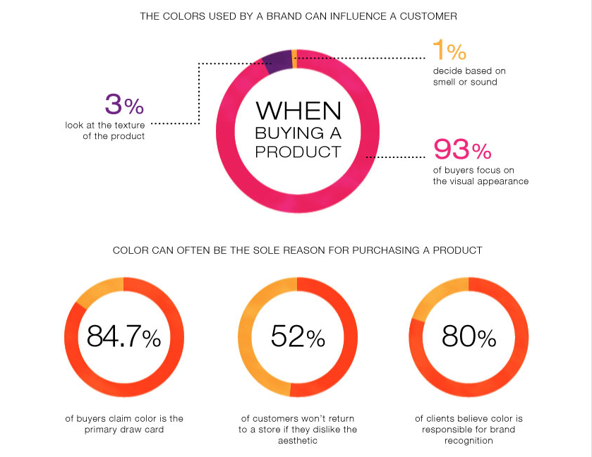
Colors are key factors in the branding strategies of companies. We could say that the success of the brand and its products depend on them. Visuals are more important than ever – that’s why the “clothes of the brand” can make it either undeniably recognizable or easily neglected. Why? It’s simple – colors have a psychological effect on people’s emotions and the way them make decisions. Studies show that 85% of people make a decision to buy on the basis of product or/and packaging color. And it only takes 90 seconds for someone to form an opinion about a product (60% – 90% of the factors leading to that decision are based on color).
Source: dashburst.com
***
“Every brand with
VISUALS THAT STAND OUT
becomes recognizable, wins the hearts of its audience and fulfills its marketing goals more easily”.
***
How do brands choose which colors to use and what do colors “say” in general?
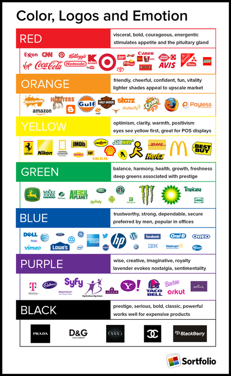
YELLOW is most often associated with optimism. It has the radiance of youth, energy and lightness. Some call it a “safe” color because it’s never associated with anything serious or threatening. Mostly it’s used to draw attention.
ORANGE speaks about creativity, friendliness and enthusiasm. It unlocks the desire to have fun and celebrate life. That’s why it’s most commonly used to reach younger audiences.
RED tells it all! Passion, speed, love & courage! It’s the Color with capitol “C” – it activates, stimulates and awakens powerful emotions. That’s why only a brand with a daring personality can pull off the color RED. A perfect example is Richard Branson’s Virgin Group.
PURPLE is the color of luxury, royalty and wisdom. A color that screams ambition and creativity. Every brand with that identity invites its customers to enter into the world of “unlimited opportunity” where they can have and be “more”. Purple is a bold color that conveys the message of opportunity and leadership. Very often it’s associated with trust and influence. It’s also used in the Beauty industry, especially with luxurious, high quality wellness products.
PINK brings the message of romance and care! Intense pink (magenta) speaks about standing out and femininity. In its lighter tones it’s perfect for brands targeting young teenage girls.
GREEN speaks a lot of languages! It tells the story of growth, new birth and natural freshness. It reminds us of tranquility and relaxation. In its darker, more intense tones it’s associated with wealth, prosperity and abundance.
Green is a complicated color which gives a sense of security and intrigues all at the same time. But most importantly – it’s definitely the color of brands with natural products – bio food, natural cosmetics or clothes from natural material.
BLUE is used in so many contexts – it’s just too hard to put it in a box! But we can definitely say that blue is the color of dependability. It gives a sense of strength, calmness and security. That’s why so many brands trust its message! Think about it – IT companies (Samsung, Dell, HP); engineering (General Electric, Ford); financial services (PayPall, American Express), even most of the social media platforms are blue (Facebook, LinkedIn, Twitter).
Without doubt blue is the most powerful and influential color because people trust it – security and dependability. No wonder it’s everyone’s favorite – 57% of men and 35% of women prefer blue to other colors.
In its lighter tones blue can be associated with calmness, rest, compassion and care. But in most cases it’s associated with high quality and high tech brands.
BROWN is the color of nature and relaxation, luxury and tradition. Mostly it speaks about an established brand, a company with a long history, a lot of experience and expertise. The color brown has an earthly, simple and honest message, yet classical, authentic and hard to copy.
BLACK is bold, powerful and confident and speaks about strength, prestige, manliness and style. It’s often used in luxurious and high quality products. Black is emblematic for authority and importance. Many brands prefer the color black simply because it stands good on its own.
WHITE carries the message of simplicity. That’s why it’s used by brands that want to accentuate on their simple style, like Apple. The color white is also associated with the baby industry and with products that communicate cleanness and hygiene.
Which colors do brands prefer?
Source: sortfolio.com
VIDEO: Color Theory & Branding
LINKEDIN SlideShare Presentation: 110 Color Banner Design Inspiration
VIDEO: Color Psychology in Movies