
A Key Vision for a Key Moment
Our experience in the retail sector once again led us to a new retail park. The opening of the new commercial location in Plovdiv was approaching, and it was undoubtedly a large-scale project. The project needed positioning.
The Investor and the Project
PARK MAXX was preparing to open its doors in the heart of the city under the hills, and not just anywhere, but in one of the most densely populated neighborhoods of Plovdiv – “Kyuchuk Paris” – between Kuklensko Shosse Blvd. and Industrialna St. And that wasn’t all that was key. The park was being built on a plot of nearly 42 acres, with a commercial space exceeding 20,000 square meters. PARK MAXX was designed not only as the largest retail park in Plovdiv but also as one of the most ambitious projects in all of Bulgaria.
The retail park brings together a variety of stores, service outlets, and establishments such as Lidl, Technomarket, ProCredit Bank, NIKO pastry shop, a pharmacy, optician, drugstore, fashion stores, a children’s center, a gym, and many more, which will be gradually added as the project develops.
Insight
When PARK MAXX approached us, it already had a logo and an impressive mix of commercial outlets. However, it was still missing something crucial – a clear and distinctive visual identity that would make the city’s residents learn about it and talk about it – it was yet to be positioned. The freaks took on the task of conveying the park’s scale, the diversity of its commercial offerings, and its key location.
We knew that Plovdiv was a highly competitive market when it comes to modern commercial properties – shopping malls and retail parks. Therefore, we focused on the key advantages of the park and took a strategic approach, seeking a message that would feel like “the place for everyone” – whether it’s for families, sports enthusiasts, fashion queens, or office ladies. And so, we arrived at…
The Creative
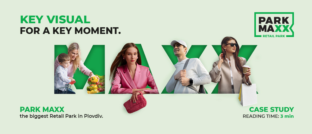
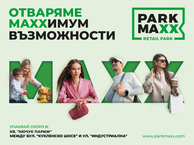
We created a key vision and slogan that would both clearly and creatively, yet cleverly, communicate that PARK MAXX is the retail park of maximum possibilities. The vision incorporated different “characters” reflecting the park’s target groups – from family shoppers to young people with a sporty spirit or fashion sense. This reinforced and emphasized the feeling that PARK MAXX is not just a commercial space, but a place for everyone.
We approached the color palette with care, ensuring that we both adhered to the established logo colors and infused a sense of freshness and something new. Compositionally, we wanted to highlight the idea that the park is a place for everyone, while also ensuring that the vision would stand out in both the urban environment and the online space.
Media Planning and Results
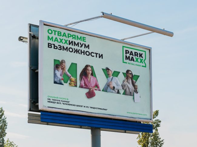
To ensure a strong presence in the city and announce the upcoming opening of the retail park – phase 1, we launched a two-month OOH campaign, positioning the key vision at strategic locations throughout Plovdiv – in the city center, near major traffic arteries, residential areas, and other key and communicative points.
PARK MAXX is just one of many examples of how good creativity, combined with strategic thinking and a sense of consumer needs, can effectively position a brand.
Follow our blog to see more inspiring projects from the world of positioning and MAXX creativity.